Mobile Market
LA Regional Food Bank Companion App

Duration
16 Weeks - Fall 2021
Main Roles
UX Research
Digital Prototyping
2D Animation
Team EnoMaet
Christian Suarez
Liz Martinez
Andres Munoz
Mathias Moslehi
16 Weeks - Fall 2021
UX Research
Digital Prototyping
2D Animation
Christian Suarez
Liz Martinez
Andres Munoz
Mathias Moslehi
The team's selected client was the LA Regional Food Bank.

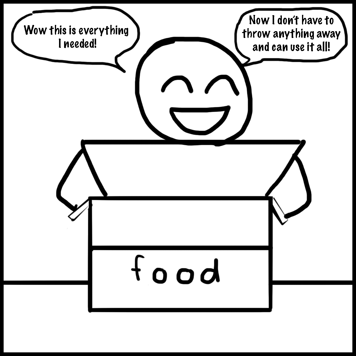
The LARFB currently donates randomly selected food to its recipients and does not have a clear way for people to find food drive locations or hours.
Many food assistance recipients are unable to make use of all the food they receive due to food allergies, preferences, or being unable to transport it, resulting in further food waste. On the food bank side, food acquisition officers have no way of knowing what their recipients want and therefore have to guess what foods to give.
A mobile application which empowers participants by allowing them to go through their own shopping experience. With this app, the food received from the food bank is personal to the individual and limits waste from the current system.
We began by conducting secondary research to better understand the issue of food waste. Topics such as when what food waste is and when it began to become an issue, its root causes, and who it affects were all looked at further in depth. All of this information was looked at from a global perspective first and then from the smaller perspective of only the greater Los Angeles area.
We generated a point of view to give us a place to look at the problem from. We were then able to use this POV as a lens to generate multiple how might we statements and further ideate upon possible solutions to the issue. We selected three possible HMWs to move forward with.


We researched how people use clothing and how it intersects with activities and cultures. We decided to create a clothing product and named it "Glow in The Drip apparel" that can interact with a Meow Wolf App.


We looked further into the current journey of our users to better understand exactly where there is room for solutions. We also added a third proto-persona and created their journey map. With our prior two personas we were looking at Alberto who was a food retail manager and Jeanna who worked for a food bank as an acquisitions officer. Our third persona helped us fill a gap and closer analyze the journey of Lorraine who is a food donation recipient.
We proceeded to conduct both in-person and virtual interviews with people that were in either the same or similar positions as our three personas. Those interviewed included food retail managers and employees, the LARFB food acquisitions officer, and food donation recipients. From these interviews we were able to discover and highlight the moments that matter for our users and gain their insights.

We presented three possibilities for solutions to our fellow designers and received their feedback. Based off of their feedback and our prior research we decided to move forward by allowing food donation recipients to make their own choices. We decided to complete this through a mobile solution in order to cater best to our target user.
We performed a competitive analysis on existing digital food shopping and food delivery processes. We wanted to create a similar experience for our users. We looked at the various features and processes within these digital platforms to see what things were successful and what things could either be redesigned or excluded in our solution.


To better communicate the entire process someone would go through using our product we created a storyboard.

We started the design phase by creating the information architecture for our solution. This helped ourselves better understand the various pathways users would take to get through the app.


We drew out rough sketches to test different layouts on all of the various pages. Doing this on paper allowed quick changes and iterations to be completed before moving into digital creation.


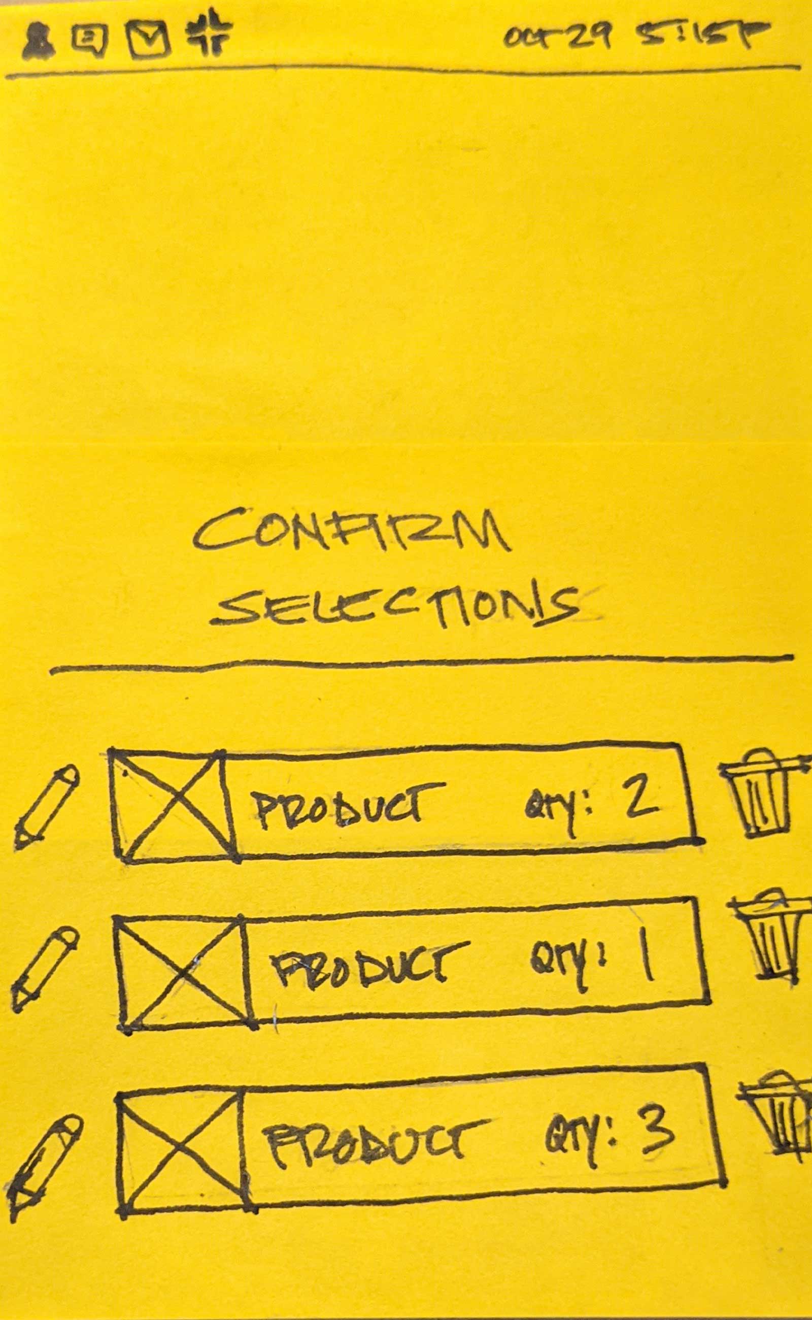
We moved our selected wireframes into Figma and began creating the page layouts digitally. We also began testing various colors and typefaces.


Once our mockups were completed we went through multiple prototype iterations in Figma. We began with a black and white clickable lo-fi prototype to mainly test how various functions could work . We then moved on to a mainly black and white mid-fi prototype that added more features and multiple layouts for testing.
We conducted usability testing with our current prototypes. We tested for any usability issues and flaws completing necessary steps in the app. We observed testers going through these steps and received feedback on the app.


.gif)


